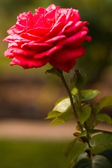
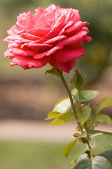
Which one do you prefer?
Search This Classical Life:
categories:
in the middle of:
read in 2016:
Paterson, The Great Gilly Hopkins
Sloan, Ajax Penumbra 1969
Mandel, Station Eleven
Elliot, Shadow of the Almighty
Shakespeare, As You Like It
Bolz-Weber, Accidental Saintsarchives:


The bottom one for the rose, the top one for the leaves…
i like the intensity of the top photo, but it is a little dark around the leafy parts. The straight from camera one is a little light on the bloom and spot-on for the foliage. Do you use a program you can do selective colorization?
Probably. I don’t spend a lot of time editing (obviously).
Both pretty. I am leaning towards the bottom one, though.
I have to prefer the top one. I think the darker background really makes the color in the flower pop.
I like the bottom one best. It shows more texture.
I like the top one– the shadow adds depth, intrigue. Richer, I think.
But the second is better if you’re going for clarity of detail and a more realistic style.
Still, I prefer the top.
Top.
top
You should layer the bottom one (the lighter) on top of the darker one, but mask out everything on the lighter so that only the rose petals show from that layer. Then gradate the edges of the mask and the layer’s attributes so it blends well enough to look like a single photo.